v0 changed how developers think about building UIs. Type a description, get a React component. For quick prototyping and exploring ideas, it’s genuinely useful. I use it regularly.
But I’ve also learned where it breaks down. And understanding those boundaries matters, because reaching for v0 in the wrong situation costs more time than it saves.
What v0 does well
Let’s start with credit where it’s due.
v0 is excellent at generating standard UI patterns. A settings page. A data table with sorting. A login form with validation. A card grid with hover states. For these patterns, v0 produces clean, accessible code using shadcn/ui components that you can drop into any Next.js project.
It’s also a powerful ideation tool. When you’re not sure what a feature should look like, generating three variations from slightly different prompts is faster than sketching wireframes. v0 is a thinking aid as much as a code generator.
Where v0 struggles is precisely where prompts struggle: describing visual specifics.
The prompt precision problem
Try describing this to v0: “Build me the exact hero section from Linear’s homepage.”
v0 will give you a hero section. It might even be a good one. But it won’t be Linear’s hero section. It won’t have Linear’s exact gradient values, their specific letter-spacing on the headline, the precise padding between the tagline and the CTA buttons, or the subtle animation timing on the background.
This isn’t a failure of v0’s AI. It’s a fundamental limitation of the prompt interface. Language is imprecise for visual design.
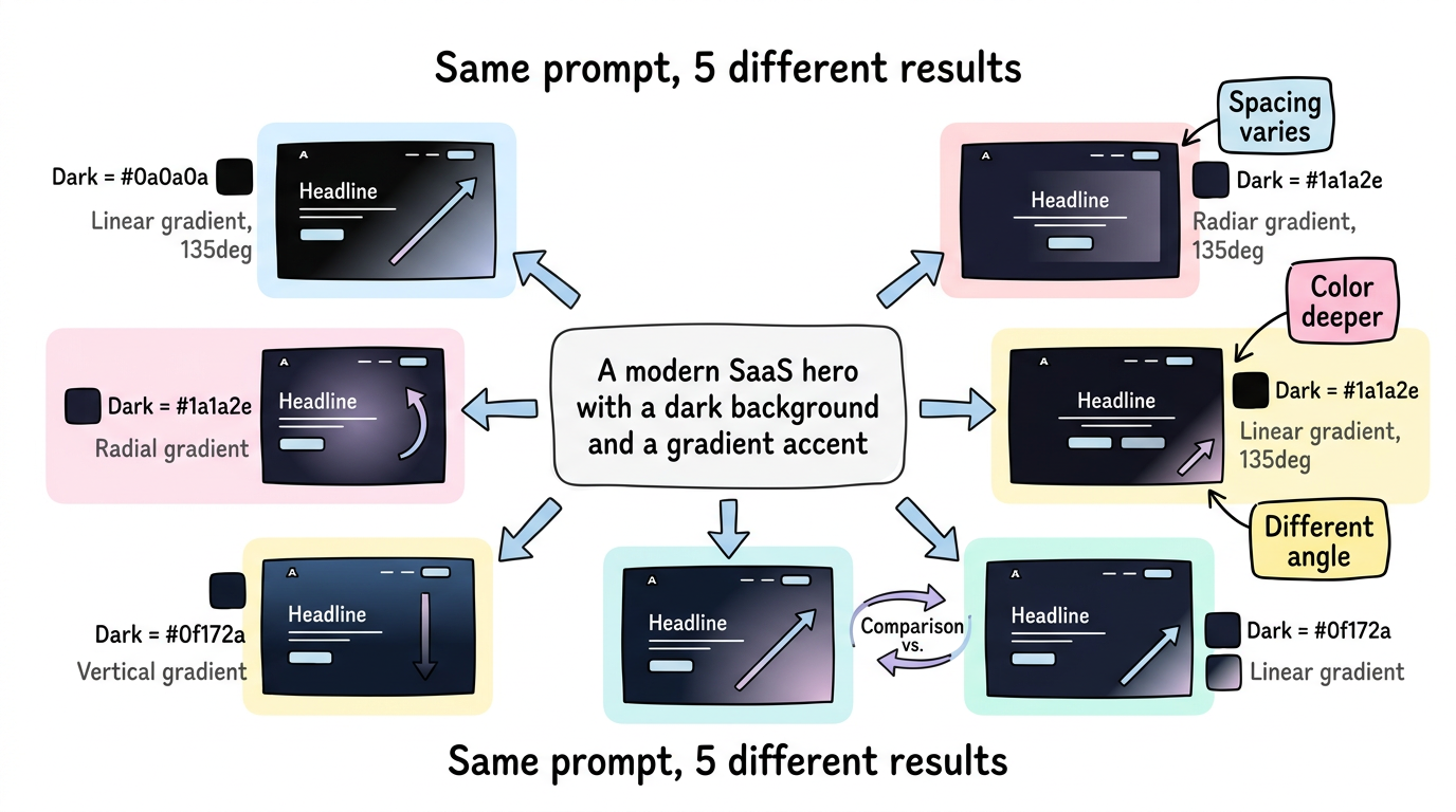
Consider: “a modern SaaS hero with a dark background and a gradient accent.”
What shade of dark? (#0a0a0a? #1a1a2e? #0f172a?) What gradient? (linear? radial? what colors? what angle?) What “modern” means varies by the year, the industry, and the person asking. v0 makes reasonable choices, but reasonable is not specific.
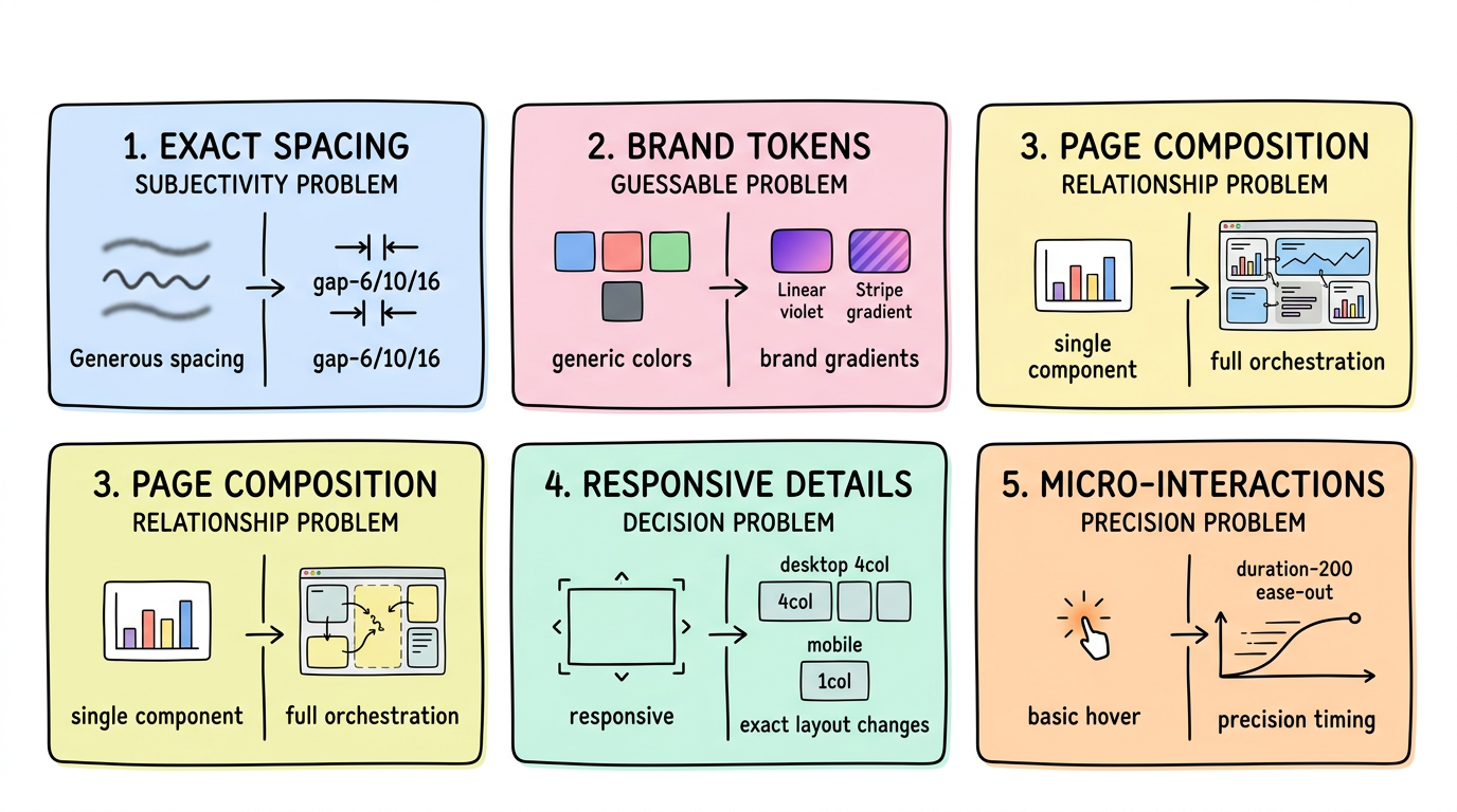
Five Limitations of Prompt-to-Code Tools
1. Exact Spacing and Layout Proportions
Prompt: "A three-column feature grid with generous spacing"
“Generous spacing” is subjective. v0 might use gap-8. The site you’re trying to match uses gap-6 on mobile, gap-10 on tablet, gap-16 on desktop, with a custom max-width of 1152px — not Tailwind’s default max-w-7xl (1280px). These details are invisible in prompts but immediately visible when two designs sit side by side.
2. Brand-Specific Design Tokens and Colors
Every established brand has a color palette that extends beyond “blue and white.” Linear uses specific hues of violet and indigo with carefully chosen opacity values for their glassmorphism effects. Stripe uses exact gradients with precise color stops. These aren’t guessable from descriptions.
v0 defaults to shadcn/ui’s design system — which is beautiful but generic. If your project needs to match an existing brand, you’ll spend more time overriding defaults than you saved by generating.
3. Multi-Section Page Composition and Vertical Rhythm
v0 generates individual components well. What it struggles with is the composition of an entire page — the vertical rhythm between sections, the way a hero transitions into a feature grid, how the background color shifts across sections, the consistent spacing system that ties everything together.
A well-designed landing page isn’t a stack of independent components. It’s an orchestrated sequence where each section flows into the next. Prompts can describe sections; they can’t easily describe the relationships between sections.
4. Responsive Design Breakpoints and Behavior
“Make it responsive” produces reasonable breakpoints. But real responsive design involves specific decisions: at what width does the navigation collapse? Do the feature cards go from 3 columns to 2 to 1, or 3 to 1? Does the hero image shrink proportionally or get cropped? Does the heading font size follow a specific type scale?
These decisions define the quality of a responsive implementation, and they’re nearly impossible to express in prompts without writing more text than code.
5. Micro-Interactions and Transition Details
Hover states, focus rings, transition durations, easing curves, scroll behaviors — the details that separate a polished UI from a generated one. v0 adds basic hover states, but the exact transition-all duration-200 ease-out that makes a button feel right on a specific site isn’t something prompts capture.
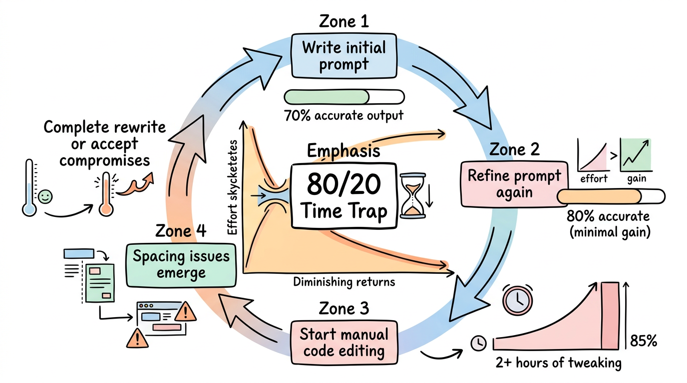
The 80/20 Problem: Why the Last 20% Takes 80% of the Time
These limitations compound in practice. A developer using v0 to match an existing design follows this cycle:
- Write a prompt → get 70% of the way there
- Refine the prompt → get to 80%
- Start manually editing the code → spend 2 hours on the remaining 20%
- Realize spacing is off → more manual edits
- Client says “this doesn’t match the mockup” → start over
That last 20% takes 80% of the time. And it’s the 20% that matters most to clients, design teams, and brand-conscious companies.
When you have a reference, start from the reference
The alternative to describing a design in words is to point at a design that already exists.
This is the approach ui.rip takes. Instead of:
Prompt: "Build a hero section with a dark gradient background,
large bold heading in white, subtitle in gray-400, two CTA
buttons side by side, the primary one with a gradient..."
You provide:
Input: https://the-site-you-want-to-match.com
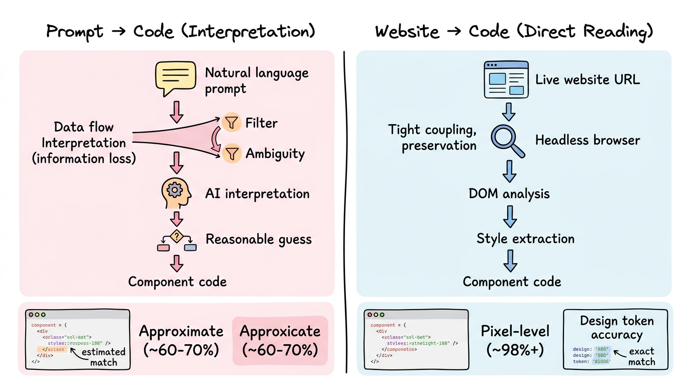
The pipeline captures the rendered page, reads the actual computed styles (the exact #0f172a background, the exact 1.125rem letter-spacing, the exact linear-gradient(135deg, #6366f1, #8b5cf6) accent), and generates components with those precise values.
No interpretation. No approximation. The design tokens come from the design itself.
v0 and ui.rip are complementary
This isn’t an argument against v0. It’s an argument for using the right tool for the situation:
| Situation | Better Tool |
|---|---|
| Exploring layout ideas for a new feature | v0 |
| Matching an existing design precisely | ui.rip |
| Building a quick internal tool | v0 |
| Migrating a WordPress site to React | ui.rip |
| Generating a form with validation | v0 |
| Extracting a competitor’s component patterns | ui.rip |
| Prototyping during a brainstorm | v0 |
| Agency work with approved designs | ui.rip |
The best workflow often uses both: ui.rip to capture the reference design and extract its patterns, then v0 to generate new sections that didn’t exist on the original (a new pricing tier, an FAQ section, a testimonial carousel).
FAQ
Will v0 get better at matching specific designs?
Probably — multimodal models that accept screenshots as input are improving. But even screenshot-to-code approaches face challenges with exact design token extraction, responsive behavior, and component boundary detection that reference-based analysis handles natively.
Can I paste a screenshot into v0 and get an exact match?
v0 supports image inputs, and results have improved significantly. But there’s a gap between “looks similar” and “uses the exact same colors, spacing, and typography.” Screenshot-to-code approximates; reference-based extraction measures.
Is ui.rip just for copying other people’s designs?
No — it’s for any scenario where a live website is your starting point. Most commonly: migrating your own site to a new framework, rebuilding an internal tool from a reference, or studying how well-designed sites structure their components. The output is React/Next.js code that you modify and build upon.
Start from what works
Prompts are a powerful starting point — when you’re starting from nothing. But when a working design already exists, starting from a description of that design adds an unnecessary translation layer.
The most efficient path from “that looks right” to “my code looks like that” is a direct one.
Match an existing design: ui.rip — paste a URL, get React components with exact design tokens.
Generate from a prompt: v0 — great for new designs and rapid prototyping.
→ ui.rip vs v0 detailed comparison → Convert any website to React → v0 vs Bolt vs ui.rip comparison